Pawradise.
Redesigning, App Design, User Interface Design
December 2024
Introduction
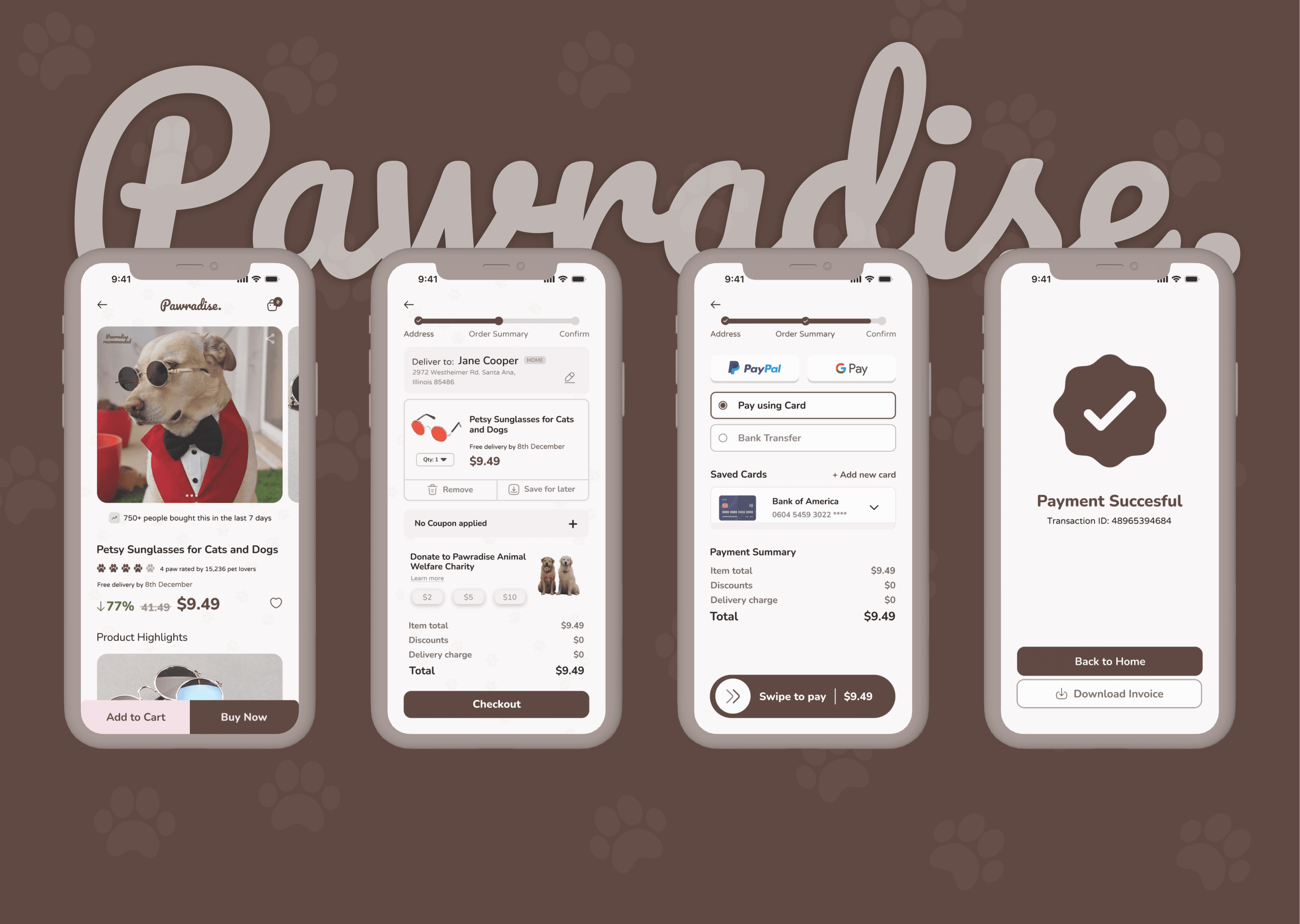
The Pawradise app UI is a clean, elegant, and user-friendly interface that prioritizes a seamless shopping experience for pet lovers. The warm brown tones of the design complement the theme of pets and create a cozy, welcoming atmosphere.
Description of Screens:
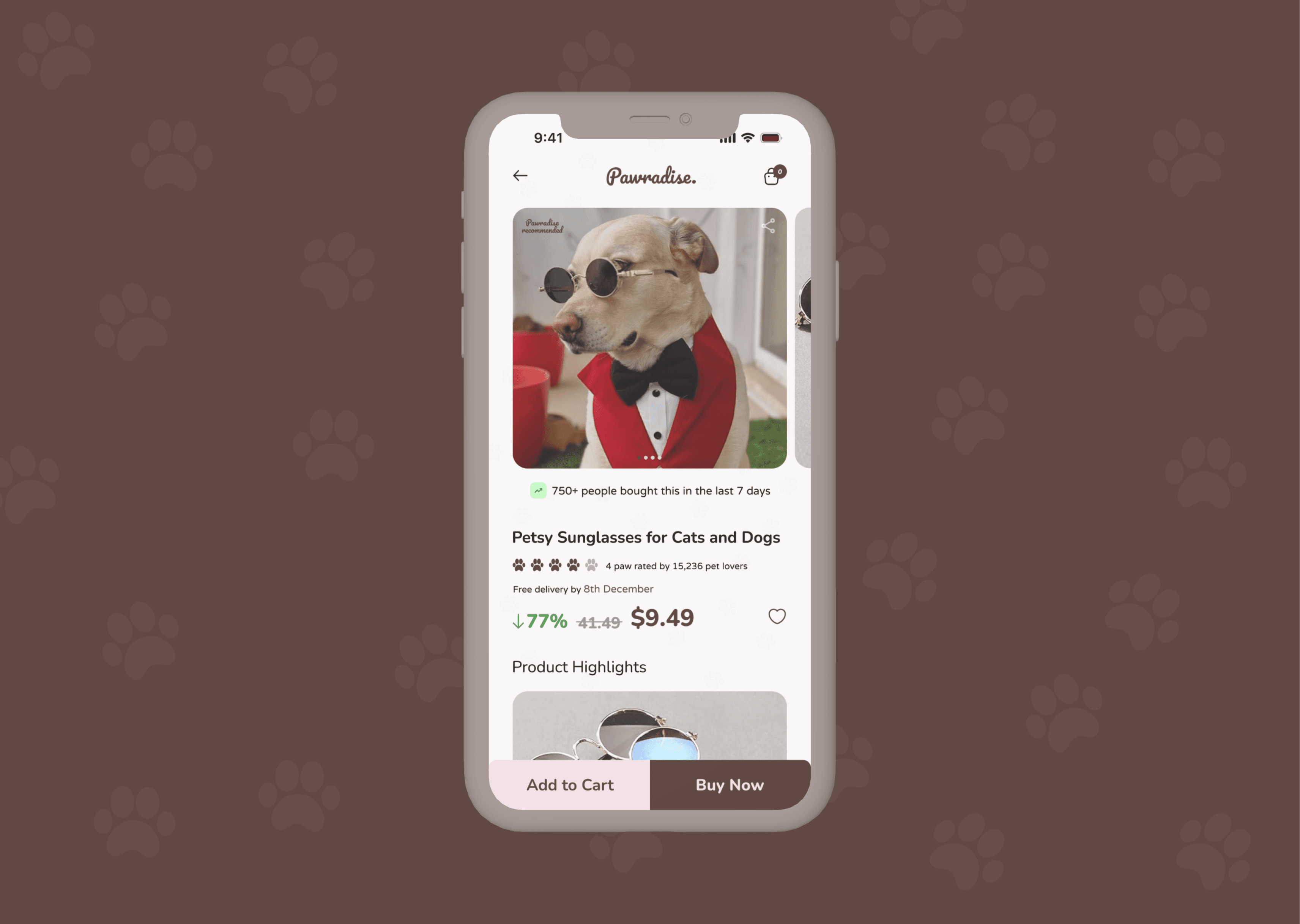
Product Details Screen
Showcases a featured product, "Petsy Sunglasses for Cats and Dogs," with an attractive image of a dog wearing the product.
Highlights include ratings, reviews, discounts (77% off), and free delivery information to entice users.
Clear "Add to Cart" and "Buy Now" buttons ensure quick action for shoppers.
Cart and Order Summary Screen
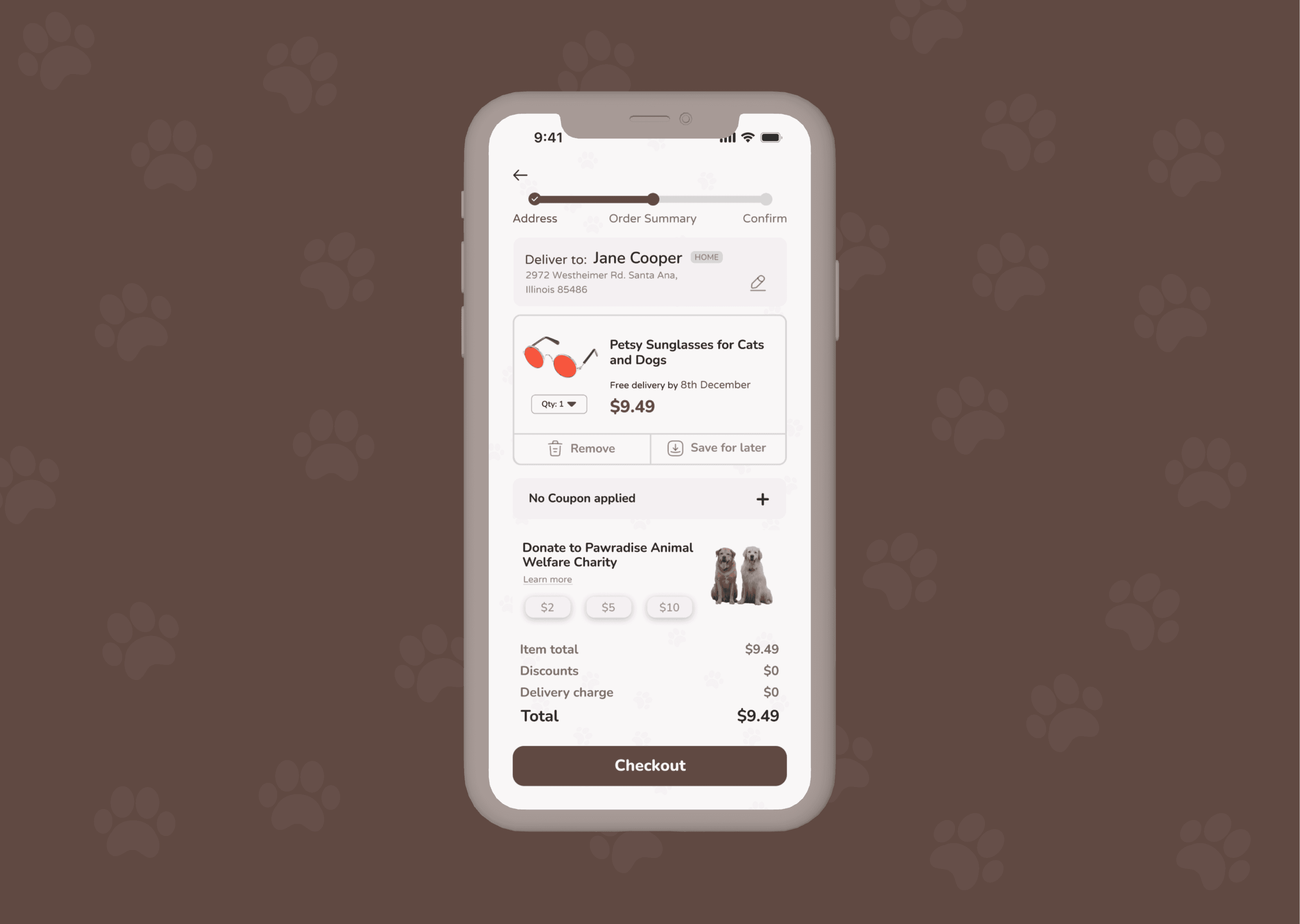
Displays a concise summary of selected products with a clean layout, including item details, price, and quantity controls.
An optional donation section encourages contributions to animal welfare, integrating a sense of community responsibility.
Prominent "Checkout" button guides users to the next step smoothly.
Payment Screen
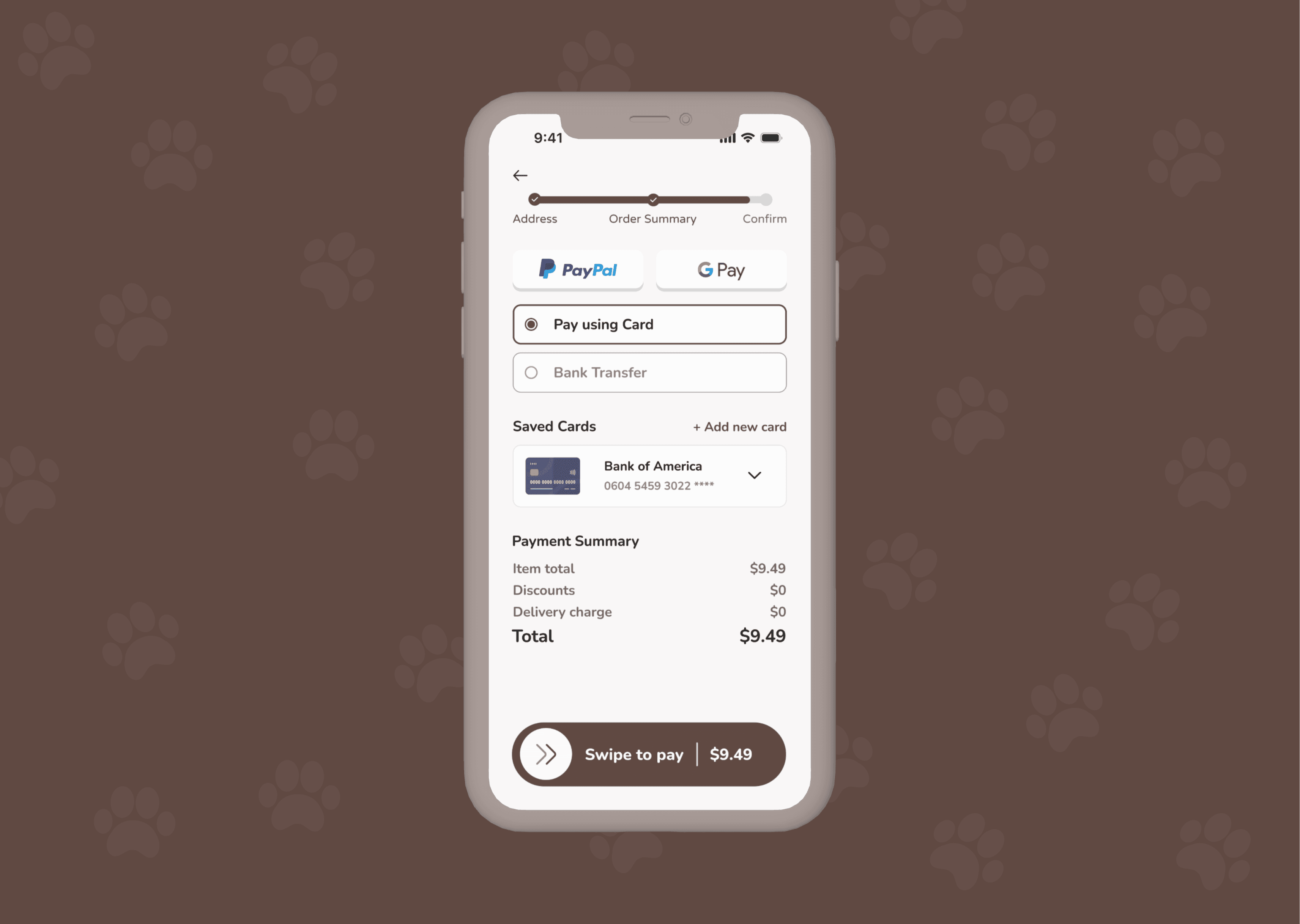
Offers multiple payment options such as PayPal, Google Pay, and card payments, providing flexibility for users.
The "Swipe to Pay" feature adds a modern touch, enhancing the payment experience.
A detailed payment summary ensures transparency in pricing.
Payment Confirmation Screen
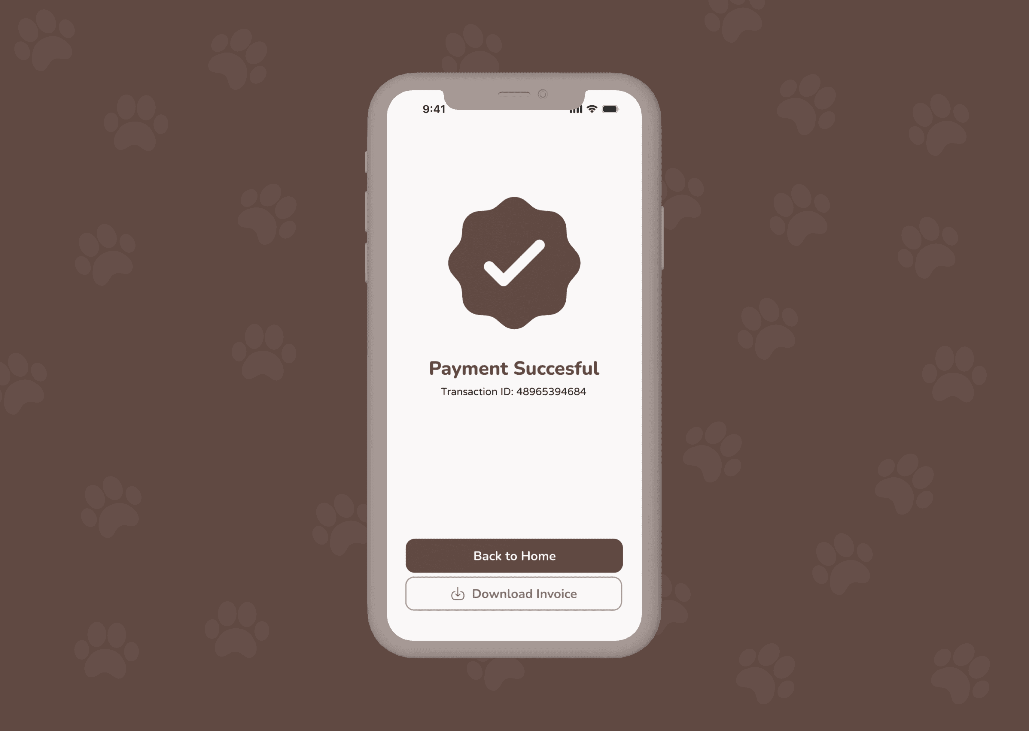
Features a simple yet effective confirmation screen with a checkmark icon and transaction details.
Includes options to "Back to Home" and "Download Invoice," adding convenience post-purchase.
Key Design Elements:
Consistent Typography and Icons: Ensures readability and visual hierarchy across all screens.
Minimalistic Layout: Focuses on functionality while maintaining visual appeal, reducing distractions.
Responsive Navigation: Provides users with a logical and effortless shopping journey.
Brand Identity: The paw-themed background and color scheme reinforce the app's focus on pets.
This UI is thoughtfully designed to make shopping for pets enjoyable, efficient, and visually appealing for users.